This is going to be a long write-up and we decided to let it grow overtime by adding new tutorials, every once in a while. Please note that this is a personal text with personal views on cinema, and the style of writing could be categorized as ‘write to think’, and the aim isn’t to proclaim truth. This essay might not be for everyone.
The 2nd part of this essay will contain tutorials on how to ‘color’grade and how to draw power mask to finish in Black & White (b&w).

Black and White is the foundation of Cinema, and often referred to as classical and superseded. But this is the first paradox of the so called progressive contemporary cinema institute, it often comes across as conservative by suggesting such bold ideas. *Asterix
In the eyes of Gafpa Gear the art of cinematography is about transforming an image, and not to imitate life. As a cinematographer we’re image makers and like any artists we are not commissioned to reproduce or to imitate life but to communicate our authentic vision and feelings on a meta level.
‘a kind of representation that is purposive in itself and, though without an end, nevertheless promotes the cultivation of the mental powers for sociable communication’
I. Kant
An image must be transformed by contact with other images as is a color by contact with other colors. A blue is not the same blue besides a green, a yellow or a red. No art without transformation. But unlike many art forms cinematography doesn’t have to strive for reality because it caries that weight by itself. Because you do not have to imitate, like painters, sculptors, novelists, the appearance of persons and objects (cameras do that for you), your creation or invention confines itself to the ties you knot between the various bits of reality caught. There is also the choice of the bits. Your flair decides. In a sense, the “capture” of the image is not what you do. It is merely the record of the artistic process that precedes it.
But the ‘capture’ can be owned and manipulated.
If black and white was invented today we would have looked at it as something fresh and creative, giving artists an unlimited amount of new options to express themselves. Yet on the contrary Black and White was a technical invention to mimic life, and Color film was the logical step to supersede Black and white film. Thus from a technical point of view b&w is an extinct format and inferior to color which brings us “closer” to life. This article isn’t about technical inventions but about artistry, the only reason we sometimes have to speak in a technical language is to conquer and overcome these technicalities in order to speak fluently and intuitively, the aim is clear, we want to inspire you, help finding your inner voice and and a matching tone.

To make a good image in the b&w format we are facing other artistic challenges than working in color. B&w is always originated from color en renders colors in shades of gray (luminance). In the very beginning of photography there was film that was mostly sensitive to Blue (orthochromatic) and thus rendered Red hue’s very dark. But already pretty early (1913) we had the first Panchromatic films, which were sensitive to all visible (to our eyes) wavelengths.
Filmmakers and photographers often used color filter to absorb certain wavelengths to render certain hues in a darker manner. As an example one could use a yellow filter to absorb cyan often present in an unclouded sky, and thus darken up the sky.
If art is about transforming an image, we can of course conclude that the camera records the artistic process that precedes it. But the camera has an trans-formal quality as well.
A good example of how cinematographers try to transform their captured images can be found in the tremendous amounts of time film-makers are spending in the field of ‘color grading’. The general aim of color grading seems not to strive for realism but instead to transform a captured image into something otherworldly.

Another example could be the usage of lenses, like low contrast vintage primes, or anamorphic lenses, which have a kind of 3d depth distortion characteristic. Even though the cinematographer has numerous options to render and manipulate the images he’s creating in front of his camera we can vastly conclude that shooting in b&w is the most radical of all.
Stripping away colors and instead display the world in planes of grey shades is fresh and still in a digital age barely touched (Ida, the Lighthouse, Coldwar).
The founders of cinema (Vertov, Eisenstein) had only very limited tools to manipulate their images, and were mostly occupied with mise en scène (all that happens in front of the camera). Yet today we are faced with unlimited possibility (Kino Infinity/ Kinefinity) and yet these years are very poor years for Cinema as an artistic art form and is mostly dominated by box office films and ‘filmmakers imitating the box office successes. Let’s not get sentimental or cynical but accept the fact that most contemporary films are ‘filmed theater’ and don’t speak in cinematography mother’s tongue nor artistic believes. Once we have that clear we can start to accept the challenge to make good cinema.


*asterix Opposed to fine art where artist and curators are mostly the dominating factor, in cinema the producers are leading the pack. And with a few exceptions their main interest is money (and for Harvey W. sex was an important drive). Those producers have hold back an infinite amount of films produced in b&w to such a degree that filmmakers don’t dare to shoot in b&w anymore and thus the craft was abandoned. The same goes for Aspect ratio’s, we rarely see films shot in 1.37 or 1.66 and even Kubrick his films were mostly displayed in 1.89 while framed and shot in a taller format (1.66). Cinemascope has never been an artistic invention but was driven to bring the spectacle of theater to cinema and to build wider cinemas to fit more people in. A simple visit to a museum (contemporary or classical) will show us mostly no wider frames than L. Davincy’s aspect ratio in the ‘last supper (2.0 univisium popularized by Storaro).


Film-making is image making and image making is about decision making. The eye scans mostly in horizontal direction, the wider the frame, the less framing. Framing in that regard is more about what you leave out than what’s in the frame. Gafpa Gear won’t reject anamorphic shooting, that would be hypocritical since we even sell anamorphic lenses suited for finishing in aspects like 2.39, and we’ve have openly cried in so many cinema’s watching a cinemascope movie (les quattre cent de coup, Pierrot le fout). One could say that color film superseded b&w film because it was better, but this doesn’t apply to aspect ratio’s, there’s simply not one aspect ratio (book your ticket to a random museum, and meet the biggest variety of aspect ratios). Film is political in that regard, and even the act of making a film is political, and that’s why every film -even good ones- is political art. Seldom, we see films shot in different aspects than the usual suspects (a beautiful example is Nasir by Arun Karthick, or Jauja by Lisandro Alonso both in 1.33), and they are always applauded by Gafpa Gear. One would be tremendously discounted by Gafpa Gear on the purchase of a camera if he would promise to make at least one personal film about his existentialist crisis of no longer than 10 minutes shot in for instance the Open Gate (1.5) of the Kinefinity Mavo LF and in b&w. No need to worry, every human has a crisis going on.
Transform your Kinefinity footage in great looking B&W

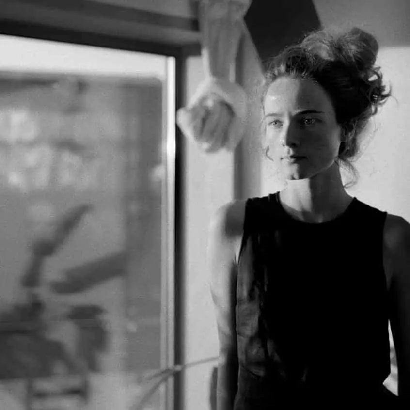
The kick-off for this first tutorial was a message from a client asking if we would be interested in shooting some b&w footage with the combination of a Mavo LF and the Leica Noctilux f0.95. We recently did a small test with the high ISO (5120) capabilities of the Mavo LF combined with the Leica Noctilux asph 0.95 which drew some attention in the community. This Leica lens not only renders sharp images in the stunning wide 0.95 aperture, but it also renders images beautifully with a distinctive look, and also performs beautifully in shallower apertures (the above image take was shot at F1.4).


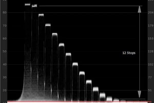
As you can see the log image is pretty dark, which is why we monitored our camera with Gafpa Gear’s own Ettl +2 Lut, so we were still able to see if the shadows were holding up, while not blowing out on the highlights (clipping). Even if one would still retain highlights, the last 0.5 stop of most cameras is suffering from color pollution and should be used for roll off, for instance on the Arri Alexa yellow clips way earlier than any other color. But the Mavo LF isn’t an Alexa. The color response of the Mavo is super good, even when underexposing, but the Alexa is a league on it’s own, and the only camera that has a real amount of 14 stops of DR.
Even though we see cameras being released with so called 14 stops and higher every day, we can conclude that these are the the big filthy lies of the camera industry that’s failing to deliver 14 stops of DR and lies about it instead. The Mavo LF has due to its very linear color response the ability to be underexposed by 2 stops like in this example. It will have around the same amount of highlights above middle gray with our ettl2 lut, as the Arri Alexa in EI 400 (6.3 stops above middle gray). The only difference is that the alexa digs two stops deeper in the shadows, but often we dont need that information and in this case it seems that most of the shadows are preserved nicely, though the Alexa will have more stretch and color fidelity, because close to its limit of the Dynamic Range any camera loses it’s linear response and color fidelity; Shades of luminance are clamped together and also severe grain is introduced, something we will have to clean up which will cause slight softness, but with a dedicated treatment will come out nicely.
Light Plan

In order to make this tutorial interesting we wanted to render the scene with a big amount of contrast. Not only did we wanted broad contrast but the contrast had to be evenly spread across the frame, so we have a lot of different patches with different luminance. In order to do so we let the sun hit the background and only touch her arm while being projected through a plant. In order to get this warm and punchy keylight in her face we used a Lightbridge CRLS nr1 to flag off the sunlight and reflect light back to the sun and reflect back with a Lightbridge diffusion nr2 CRLS right in her face under a slight different angle than the sun originally came in. We basically extended the sun and made an offset in its angle and diffused it slightly. All of this was done within minutes, because working with someone who only came inside the office to ask for a pen is quite stressful. Asides from the hotspot on the window frame (which contains polarized light) the scene measured a total of 12.8 stops of dynamic range measured with a Sekonic digital master spot meter.
Re-lighting in Post
Asides from the black and white color transform (which we will go in depth later on),
we have the ability to re-light our images in post. Of course we are faced with a one dimensional image, so our options are limited, but due to our black&white mastering we can go more extreme with re-lighting in post, because we only have to control the luminance and contrast, and working with color makes it way harder to draw realistic masks with re-lighting parameters attached. In the following images we will show you all of the masks we have drawn in our tutorial in order to re-light our scene. This was mostly done with contrast and brightness, but we used our color channels as well to change the look and feel of the final B&W image.


‘Color’ grading your color footage into B&W

In the previous examples you already saw the final result in black and white, but that wasn’t simply a matter of de-saturating the footage. Instead we are gonna use color to determine to what shade of gray certain parts of our frame are being mapped, and we are gonna dial -in colors to create local contrast.
The first pass is a compound node for noise reduction, and we’ve made a extensive post about this compound node (click here) which is specially designed to counteract some of the issues happening in the blacks of a non ‘black balanced’ Kinefinity camera. besides it has a chrome pass, and we dialed in everything in such a manner, that there’s barely any artifacts happening like softness, or weird edges. Whatever camera you will be using, the rule of thumb is to always start with a noise reduction pass before you do the rest of your grading, especially when working with color keys etc.

The 2nd node called Exposure and is to counteract the underexposed look of the log footage so we can properly see what we are doing, and can properly key out certain elements for re-lighting. All we do is using our ‘log offset; slider to push up the exposure.
In the node tree image you will see the ‘re-lighting pass’ consisting of a bunch of Parallel nodes which will blend together nicely. Hove over to the two chapters above (re-lighting in post) to see all the different masks we’ve made in the parallel node tree. In two nodes -to be more specific the eyes- we also added a bit of MD which equals a really nice sort of sharpness, especially the left eye since our focus was not spot on we added quite a bit of MD. As you can see the upper node of the parallel node hasn’t got a mask applied, we use this node to cool down the image with our white balance control, since this is a parallel node structure these changes leak in nicely in the other parallel nodes. White balance has a great impact on the final B&W image.


The node before the final node (master dmin and dmax node) is the de-saturation node,
instead of de-saturating the footage with saturation parameter, we use a different trick. Go to your RGB mixer and in the right corner check the ‘Monochrome’ box. Its good to make this node in the very beginning before you started grading and then work backwards. It’s a good practice to disable this node now and then, in order to see what your doing with your colors and how they manipulate the Monochrome image.
In order to give you an idea what’s happening in between the re-light nodes and the monochrome node, we made this screen recording where we go over all of the parameters. It’s paramount to first read this blog post before diving into the video content, because in the video we won’t go in detail with every step we’ve made in this post. Please pay notice that the free screen-recording software we use adds some contrast and sadly crushes the shadows, so we are on the look out for better software, if you have any good advice on better scree capture software then send us an email to [email protected]
Hope we were able to inspire you!